


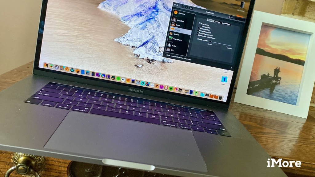
People that are struggling with colour blindness or certain sensitivities they can try out the accessibility features in Mac. The accessibility features on Mac can improve the user experience and can help the user in several possible ways. If you’re struggling with the same physical disabilities, then the contrast, invert colours and a few more features can help you out. So here’s how you can access the Visual and Color Accessibility feature on Mac.
How to Enable Invert Colors
- Press on the Apple menu.
- Tap on System Preferences.
- Choose the Accessibility icon.
- Press the Display option under the Accessibility overview tab.
- Mark on the Invert colours option.
How to Switch to Grayscale
- Press on the Apple menu.
- Tap on System Preferences.
- Choose the Accessibility icon.
- Press the Display option under the Accessibility overview tab.
- Press the Color Filters box.
- Mark on the Enable Color Filters box.
- In the pull-down menu, select Grayscale.
How to Use Shapes to Differentiate Few Settings
- Press on the Apple menu.
- Tap on System Preferences.
- Choose the Accessibility icon.
- Press the Display option under the Accessibility overview tab.
- Mark on the Differentiate without color box.
How to Reduce Motion
For macOS Sierra, reducing motion is something new that can make the animations subtle. If you activate reduce motion, you’ll see tabs jump instead of slide.
- Tap on the Apple menu.
- Press on System Preferences.
- Choose the Accessibility icon.
- Press the Display option under the Accessibility overview tab.
- Mark on the Reduce motion box.
How to Increase Contrast
If you wish to see the text and other elements on your Mac more clearly, you better increase contrast. Here’s how to do it:
- Tap on the Apple menu.
- Press on System Preferences.
- Choose the Accessibility icon.
- Tap the Display option under the Accessibility overview tab.
- Mark on the Increase contrast box.
How to Reduce Transparency
- Press on the Apple menu.
- Tap on System Preferences.
- Choose the Accessibility icon.
- Press the Display option under the Accessibility overview tab.
- Mark on the Reduce transparency box.
Reducing transparency in your macOS will show the apps icons and dock stand out. You’ll be able to see app icons, files and items more clearly.
How to Change Display Contrast
- Tap on the Apple menu.
- Press on System Preferences.
- Choose the Accessibility icon.
- Tap the Display option under the Accessibility overview tab.
- Next to the Display contrast, use the slider to increase and decrease.
Follow all these steps correctly to enable and disable your preferred accessibility settings.
Conclusion
Accessibility settings in Mac allow physically disabled users that can’t touch or hear to experience and get familiar with their device. All the features and steps that are mentioned above will help users in several ways. Apple has always focused on its apps like Siri and FaceTime on apps like VoiceOver, AssistiveTouch and Guided Access.
Blanche Harris is active in creative writing for years. His engaging and informative blogs and articles can be seen in various popular websites, e-magazine, and blogs. He also covers technical aspects of blogs and content related to webroot.com/safe to enhance users’ experience.


Voice command feature is formal and useful.
In the iPhone and iPad devices, Voice command feature is already available, which is a part of the accessibility section.
Now, for the Mac users, there is great news coming out is that they can also use the Voice command feature in Mac.
Well, if you want to explore your device in the best way, so it is a better way to use these types of new features.
It will improve your understanding and interaction with your device.Read Full Article Here - How to Use the Voice Control Feature on Mac

Voice Control feature allows the users to control their Apple device using verbal commands.
It is slated to launch on macOS Catalina in a few months.
In this article, we will explore the process of enabling and using Voice Control on Mac.
So without further ado, let’s get started.Steps to enable Voice Control on MacIn case you have not used Voice Control before, then you will have to do its setup.
Here’s how:Open System Preferences from the Dock.Now, select Accessories.In the following screen, click on Dictation mentioned below the Motor section.Click on the box next to Enable Voice Control.When you have activated Voice Control, you can give verbal commands to your device.
The Voice Control icon will appear at the right of the screen.Steps to wake or sleep Voice Control on your MacHere’s what you need to do to put Voice Control to wake or sleep:Go to the Voice Control icon at the right and select the Wake option.Go to the Voice Control icon at the right and select the Sleep option.When the Sleep mode is on, the Voice Control will not function.Steps to make changes to the default Voice Control language on your MacOnce you set up Voice Control on your Mac, you will notice it is using the device’s default language.

Accessibility features on a smartphone, laptop or even in a PC serves its user in several ways.
If a user is physically disabled in hearing, motor function or sight, accessibility features are available for them.
Now, most smartphone users know that their device has accessibility features, but furthermore, Mac users can also access the accessibility features for their own good.

Wondering how to customize contrast, colors, cursor size, transparency, and other visual stuff on your Mac?
You can tweak your Mac visual settings to make it more suitable.
Even if you wish to personalize your system interface and visuals, then you can tweak some display settings to get the most out of your device.Source : http://retailcard-activation.com/how-to-use-color-and-visual-settings-on-a-mac/We will go through some essential settings such as invert colors, switching to grayscale, contrast, and more.
Let’s get started.Inverting Colors on Your MacNavigate to the Apple menu and then go to ‘System Preferences.’Tap Accessibility.Go to the Display settings.Mark the checkbox beside the Inverted colors option.How to Enable Grayscale on Mac?Go to the Apple menu on your Mac.Now you have to click the System Preferences.Then, go to Accessibility.Open the Display tab located at the left side.Check the ‘Use grayscale’ box to enable grayscale.More To ReadHow to Download Music from Google Play Music and YouTube MusicHow to Turn Off Automatic Image Download for Email on OutlookHow to Install Beta Version of MacOS Catalina on a MacHow to Enhance the Contrast?Navigate to Apple menu> System Preferences> Accessibility> Display.Now check the box labeled as Increase contrast, and the contrast will be enhanced by a significant margin.How to Reduce the Motion?It will make the animation of your device more noticeable.
For example, if you enable the dashboard, the windows will jump rather than sliding, and it will crossfade back into its place.Click the Apple icon located at the top-left corner on your Mac.Then go to “System Preferences.”After that tap Accessibility.Navigate to the Display settings, then mark the checkbox besides Reduce Motion.How to Decrease Transparency?Go to the Apple menu on the left of your screen.Now choose “System Preferences.”After that, select Accessibility.Go to the Display settings.Check the box besides Reduce transparency.How to Adjust the Contrast on Your Mac’s Display?Increasing and decreasing contrast is a useful feature, and it is essential to know it for the hour of need.
Suppose you have started working and you are using a Mac, but the brightness is too high, which is affecting your eyes.

Notifications have become an important part of our lives.
It reminds you of upcoming emails, messages, events, meetings schedule, birthdays,etc.
It helps us to optimize our daily routine and makes many tasks very simple.
Here is how you may stop all your Mac notifications.
To do this, follow these simple steps:Disabling notifications through Notification centerIn case you wish to quickly deactivate your notifications until midnight, follow these simple steps:Go to the menu bar and then hit the “Notification Center” icon.Then search for the “Do Not Disturb” option by swiping down your page.Now turn the “Do Not Disturb” toggle button to “On” mode in order to enable do not disturb function.You may also hold down your options tab while tapping the notification center menu.Once you have enabled do not disturb feature, you will find that the notification icon will fade down.
Now Mac will receive all the notifications under silent mode until midnight or the time you have fixed.Activating Do Not Disturb feature for a fixed timeTo turn off your notifications according to the time of your preference, you may follow these steps:Go to the Apple menu located at the upper-left edge and launch the “System Preferences” option.Hit the “Notifications” option.Now disable your system notifications according to your preferred time slot.Deactivating Safari Notifications on MacFirst of all, launch Safari and then hit the “Preferences” option located at the upper portion of your menu icon.Next, launch the Website now.Then choose the “Notifications” tab located at the left-hand side menu.Now select the website notification that you wish to deactivate.Switching off the Updates Notifications Generally, the App Store application located inside the macOS provides update notifications for various installed applications on your system.If you desire to switch off all update notifications, follow these steps:First of all, go to the “Apple” icon located at the uppermost pane/bar.Then you have to open the “System Preferences” option.Now search for the App Store and hit it to launch.Then you have to switch “Automatically check for updates” to off mode.If you wish to turn it “on” in the future, tap the toggle button to “On” to get updates of every task, emails, app updates, and so on.Be sure to switch your notification tab to on mode to receive important updates related to your tasks.


