


Irrefutably, a rising number of individuals are using the internet on mobile devices instead of desktop PCs. People, on average, spend approximately 7 hours each day consuming the internet on their mobile phones. 40% of buyers research their smartphone before making an in-person purchase. Most shoppers use their smartphones to make purchases regularly, and 55% make purchase decisions after exploring things on social media. As a result, businesses with responsive websites get more leads and maintain a growing competitive edge over those that do not.Due to this change in consumer behavior, having a website that only functions from a desktop computer are no longer sufficient.Without this, you can’t reach most web users, and your organization will likely lose valuable traffic and prospects.So, how can you develop a successful mobile experience? This is where responsive web design comes into play.“Responsive Web Design always plays an important role whenever going to promote your website.” – Mr. Josh Wilson.The above quote is backed by research. As per the studies, businesses that do not have a mobile-friendly website are slipping well behind at an astonishing rate because 8 out of 10 visitors will abandon a website that does not exhibit well on their device.But what exactly is responsive website design services, how does it function, and why must you make the jump? This article aims to answer those questions, provide some relevant information, and teach you the fundamental responsive design characteristics that all businesses should be aware of. So when you decide to hire a responsive web design company to design your site, you will be fully armed with all the information you need to make it a huge success. Let’s get this ball rolling.
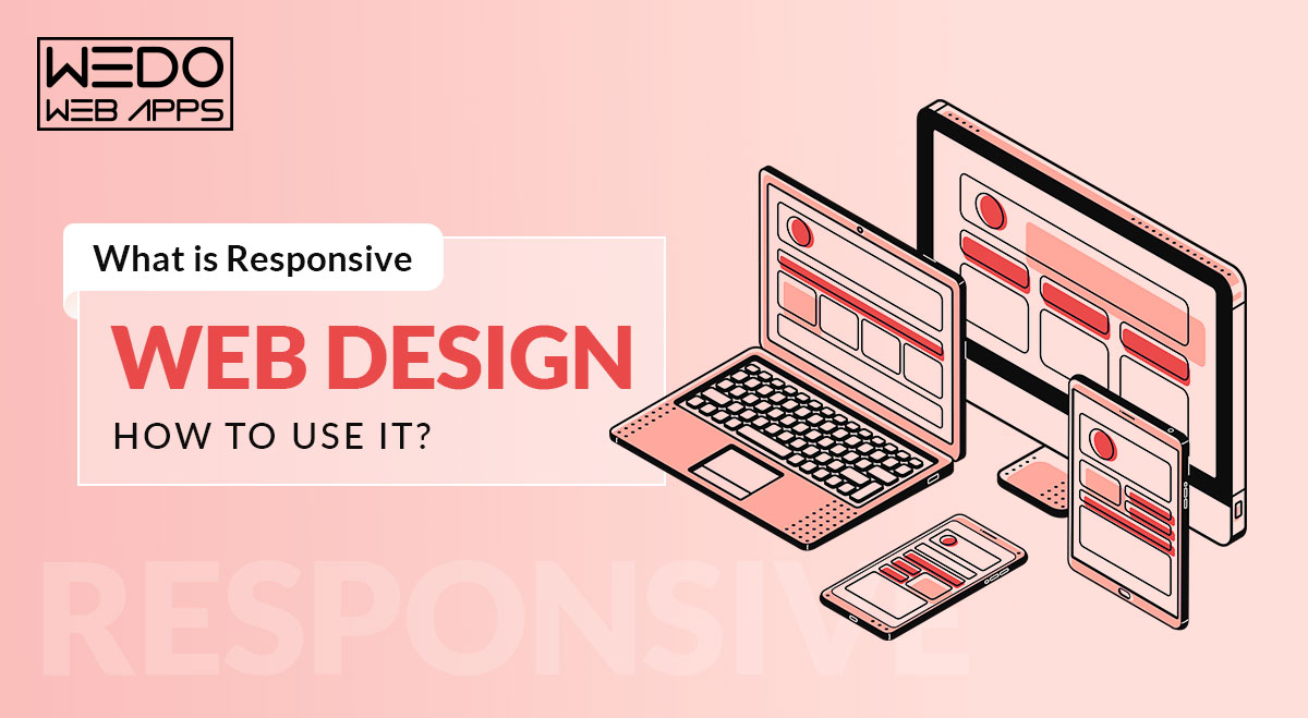
What is Responsive Design?
Simply put, responsive web design is the process of creating web pages that display optimally on all devices. Responsive websites are those that adjust to all screen resolutions and sizes, not just desktop but also mobile, iPad, and, in some cases, tv.In totality, Responsive design is a web design strategy that adapts your site content to the various screen and window sizes of various devices. For instance, your information might be divided into various columns on desktop screens since they are large enough to support that design.However, users will find it difficult to read and engage with your content if you divide it into many sections on a mobile device.Responsive design enables you to provide alternative layouts of your information and design to numerous devices based on screen size.
Why Responsive Web Design Matters?
With responsive design, you can reach a larger, more engaged community wherever and whenever they may want to browse. More significantly, a lack of flexible web design can isolate your website from customers seeking an engaging user experience. According to research, a bad mobile-friendly experience might cost you up to 90% of your potential clients...
Read detailed blog at: https://www.wedowebapps.com/what-is-responsive-web-design-how-to-use-it/


